Introduction
Dear internal and external communication professionals,
Today, B2B in Europe starts with us, because we are Europe’s most effective one stop provider to reach B2B purchasers with our own B2B platforms EUROPAGES and wlw (“Wer liefert was”) and our partner channels. We are now a prosperous online organisation with European dimensions.
Therefore, we developed our today's corporate brand strategy. Our company and its subsidiaries now do business under one name: Visable.
The Group’s renowned brands, i. e. EUROPAGES and wlw are integrated into one, stable brand architecture: a take-off point for further growth.
For our corporate brand Visable we developed a brand identity and further brand strategic components that are shown in this online Visable styleguide.
This styleguide defines our corporate design and sets the guideline for the usage of Visable’s design characteristics and helps you to adhere to them.
Why is design important for a brand?
For every brand it is important to act consistent in order to support the brand building process and to be recognised and remembered.
By putting the brand building elements, first and foremost the logo, but also the typography, colours, design principle and corporate imagery etc. together in a form that is always similar and consistent, we help our target groups to quickly and securely identify:
This is a communication activity, launched by Visable!
If, additionally and over time, positive associations come to their minds once they have identified the brand, the more likely they prefer Visable to our competitors.
This is why we would like to encourage you to use and stick to the design guidelines of Visable provided to you in this styleguide.
Kind greetings, the Visable team
Brand Strategy
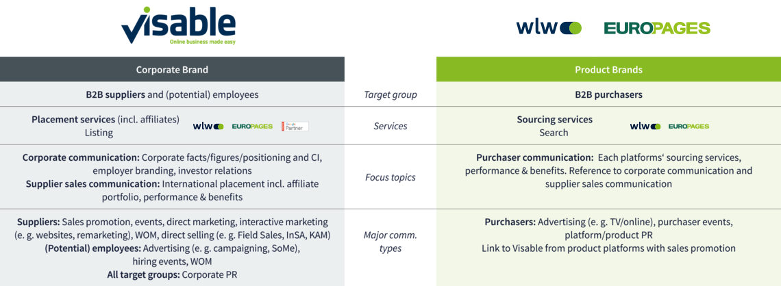
Visable addresses B2B suppliers. It is their No. 1 in Europe when it comes to reaching new B2B purchasers.
Visable is a one stop provider because it owns the B2B platforms wlw and EUROPAGES and also provides the suppliers with additional online marketing services.
- Visable is also the company’s addresser for employees. This helps the organisation to feel like one modern European company and consolidate despite our different sites and varied nationalities.
The B2B platforms are product brands. - The renowned B2B platforms wlw and EUROPAGES address B2B purchasers. Here, they can find the right B2B suppliers for their requirements.
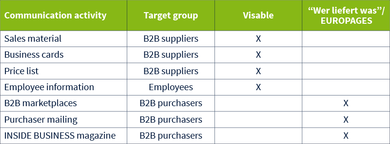
This is an exemplary list to choose the right addresser for communication activities:
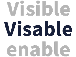
The name “Visable” is composed of two English words: “visible” and “enable”. Why Visable? Because we enable Europe's small and medium-sized companies to become visible online.

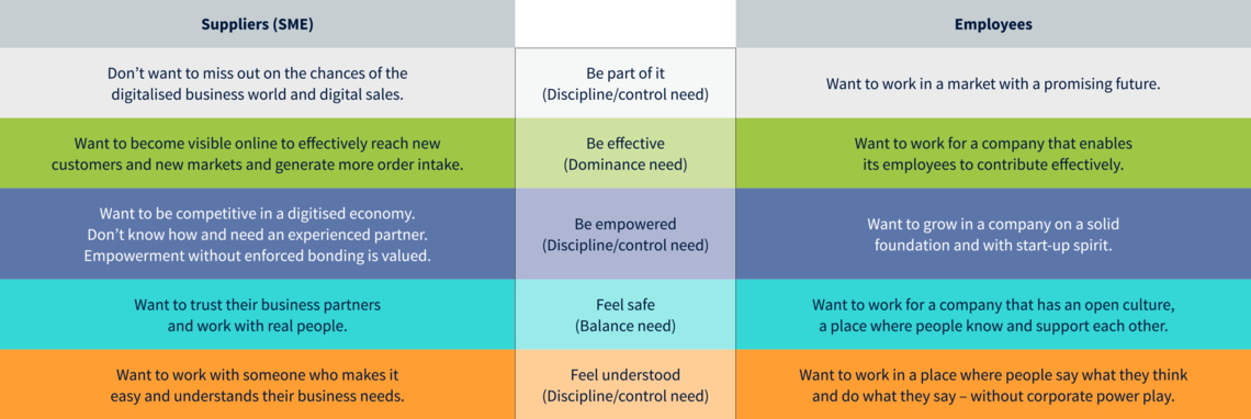
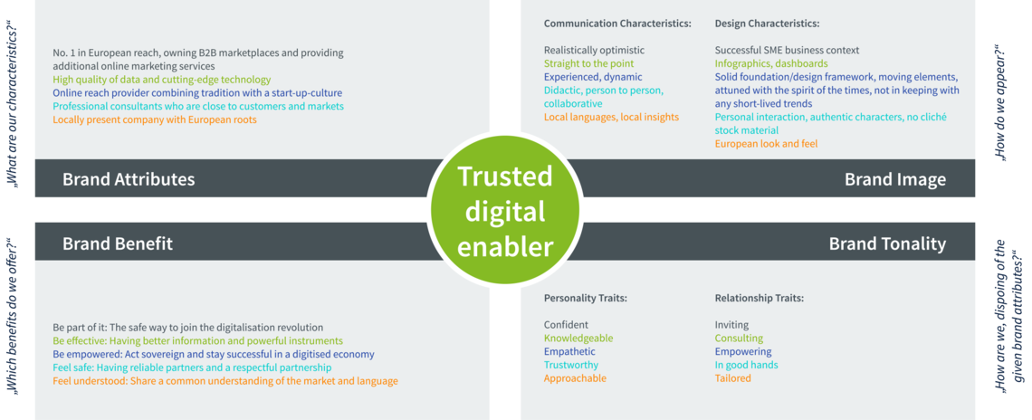
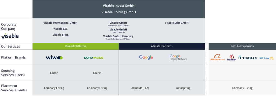
The communication is determined by different services, focus topics and types of communication.
Brand Design
1. Logo idea and concept
Both of the components, logo and claim, are expressing Visable’s core competence:
Being a trusted, confident enabler for successful B2B digitalisation, merging our owned and third party product brands’ performances under one roof.
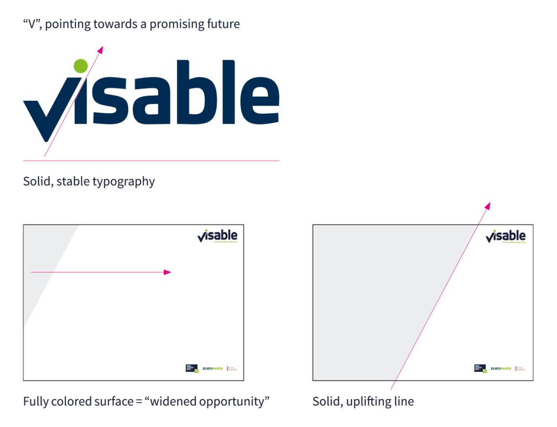
In the context of the logo, this is reflected by the V, pointing towards a promising future, as well as by a solid, stable typography – while the green and blue colours link to our owned product brands wlw and EUROPAGES.
The claim points at the online business environment – and the opportunity of being easily imparted, entering into a cooperation with us.
2. base and construction
Both of the components, logo and claim, are expressing Visable’s core competence:
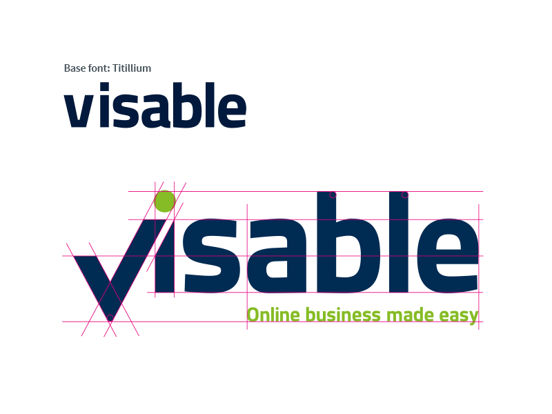
The logo and the claim are based on the font “Titillium”. The font has been modified in some places.
3. Logo clear space & size
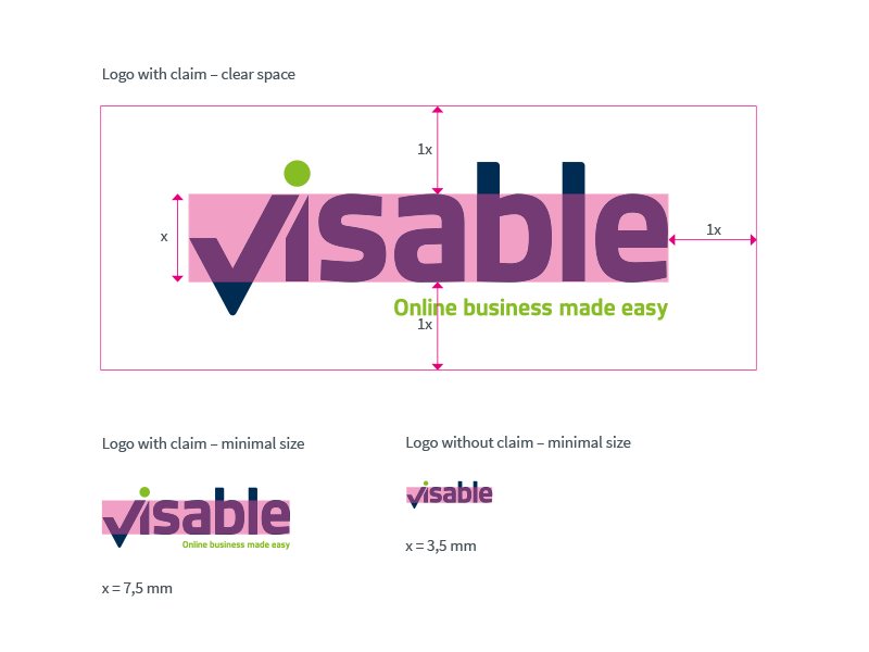
A fixedly defined clear space area positions the logo and emphasises its value. No other elements, such as fonts or foreign logos, may be positioned in the clear space area.
The clear space area is defined as “x”.
1x is the height from the baseline to the center line.
“x” should never be smaller than 7,5 mm to ensure good display quality of the Visable logo with claim.
The minimum “x” size of the logo without a claim should not be smaller than 3,5 mm.
4. Logo colour versions
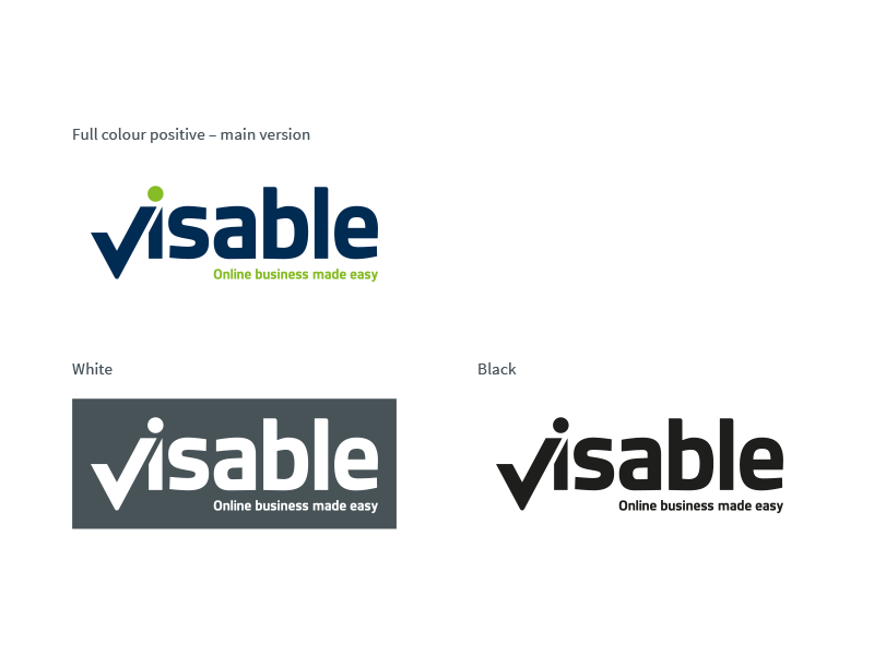
The use of the full-colour logo has priority in all media.
It must always be placed clearly on white, lightgrey, or bright pictures. This means: Do not place it on coloured backgrounds or dark pictures.
Exceptions:
• On coloured backgrounds or dark, lifely pictures, all elements of the logo can be used in white.
• For line conversions, all elements of the logo can also be displayed in black. The black and white-version may only be used on a white background.
5. Logo and claim “Online business made easy”
Adding the descriptive claim to the logo gives our stakeholders an extra opportunity to get familiar with our benefit bundle. This is why we have decided that the logo shall be accompanied by the claim as often as possible, especially in sales contexts. Please pay extra attention to its appearance where only limited information regarding the brand is provided, e. g. on a sponsorship wall. There are only a few situations where we do not use the claim alongside with the logo:
- To ensure an adequate readability, the logo shall measure at least x = 7,5 mm (cf. p. 15) to be accompanied by the claim. Please adhere to the layout principle – don't enlarge it to make that possible!
- We do not carry the information around the logo to excess. This is why a version of the logo including claim and .com is not available.
- There might be situations where a very sensitive context is concerned. You might feel that explaining the brand or even selling seems inadequate. Here, you might like to leave out the claim. Please get in touch with the brand manager, mentioned in this guideline under “contact”, to take the decision.

Here you find all logo versions for download
1. Corporate font
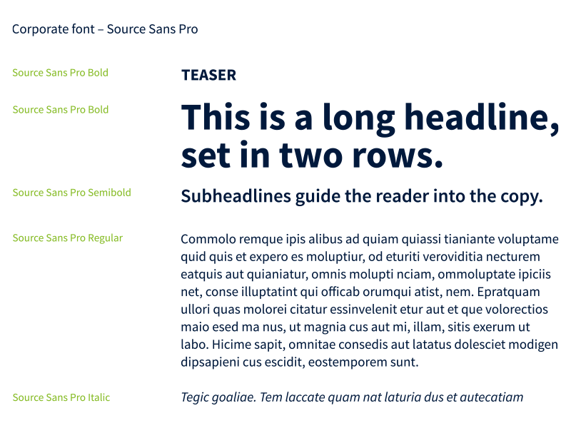
The consistent use of our house font Source Sans Pro strengthens the reference to our B2B platforms.
Source Sans Pro is a serif typeface with a humanistic look. The slightly narrow letters of Source Sans Pro are ideal for user interfaces which offer little space. Source Sans Pro works in print media just as well as it does on the screen. Only the bold, semibold, regular and italic font styles are used.
Note: The headlines can be set in "Visable Bright Green" and also in "Visable Dark Blue".
Source Sans Pro is available as a webfont and can be found on Google Fonts (click here).
2. Replacement font
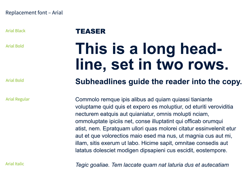
In order to ensure maximum compatibility with browsers and operating systems, Arial is stored as a fallback font for the website. Arial is a sans serif font and can be used without any complex adaptations due to its similar running width. Arial is always used when no web font and can be loaded, e. g. for e-mail-newsletters or e-mail-communication. Only the black, bold, regular and italic font styles are used.
Note: The headlines can be set in "Visable Bright Green" and also in "Visable Dark Blue".
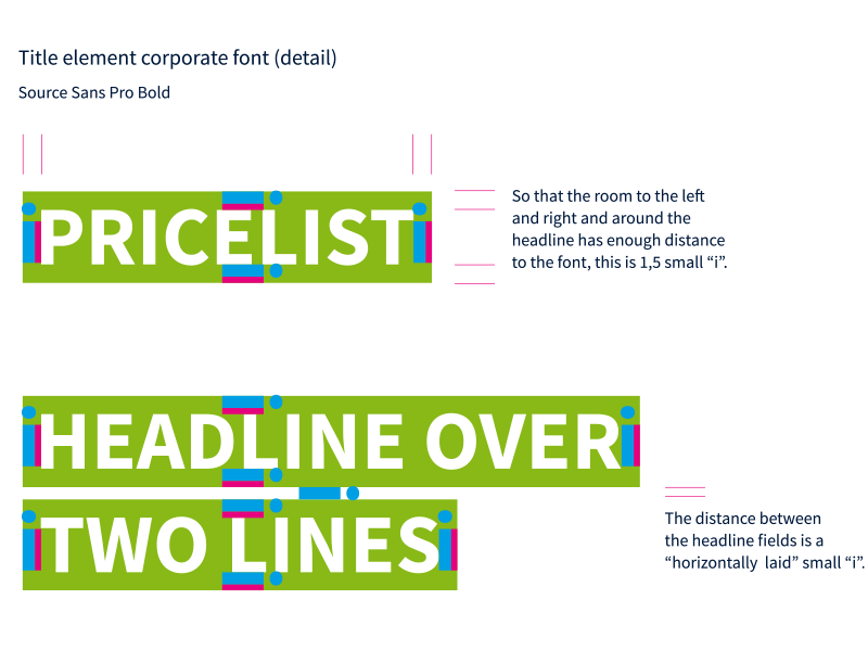
3. Title element – corporate font
As a further brand building element, headlines can be markered. This increases the visibility of the headline and directs the eye to the core message. For reasons of readability, headlines on pictures shall always be markered.
The font is always white, written in all caps and set in Source Sans Pro Bold. The background of the headlines is always formatted in the colour Visable Bright Green.
Markered headlines shall be short and crisp.
Note: To clearly indicate the addresser of a communication activity, there should always be enough space between the headline and the Visable logo.
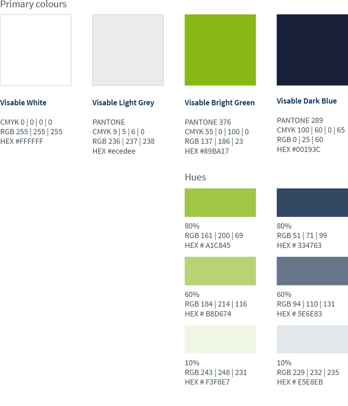
Primary colours
A reduced colour concept with the guiding colours white, light grey and green characterises the appearance and ensures a stable visual appearance.
The green is the connecting colour for the two platforms wlw (“Wer liefert was”) and “EUROPAGES”. It is mainly used in the headlines. The blue is only used as content font.

Colour climate
In order to keep the layouts fresh and clean, white and light grey are the dominating colours in all layouts. Colours should be used as highlights.
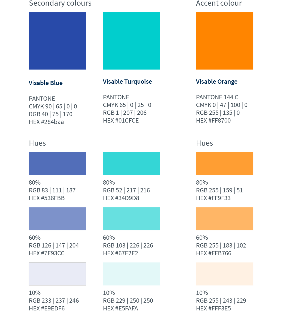
Secondary and accent colours
Within the colour climate for offline advertising media Blue and turquoise serve as secondary colours. This means they are used to a minor degree, compared to the primary colours.
Orange is used even less. It's an additional accent colour, e. g. for disrupters.
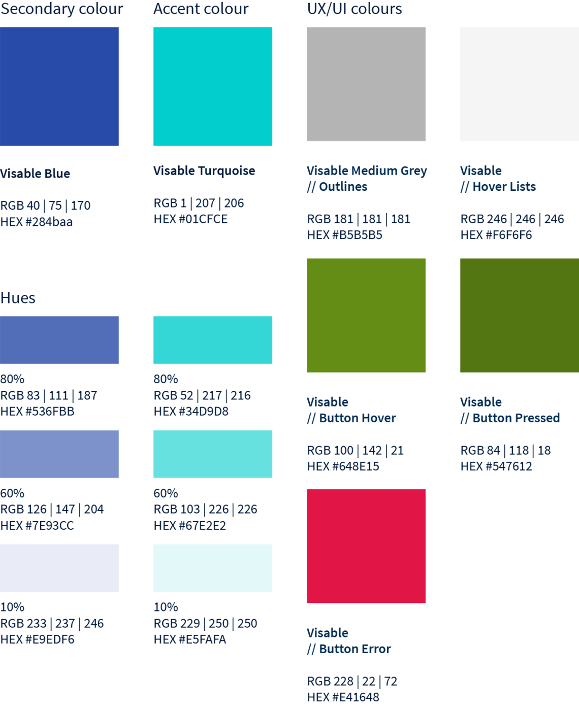
UX colours
Within the colour climate for online advertising media, blue and turquoise were optimised for screen purposes. Blue serves as a secondary colour. This means it is used to a minor degree, compared to the primary colours. Turquoise is used even less. It's an additional accent colour, e. g. for disrupters.
Visable is a trusted enabler for successful B2B digitalisation. In the context of the logo, this is reflected by the “V”, pointing towards a promising future, as well as by solid, stable typography. The aspect of a promising future is picked up on in the design principle, too!
This is how it works: We draw a solid, uplift ing line, corresponding to the angle of the V’s right leg, over a communication material’s whole surface. Boldly, we fully colour one side of the so-emerging surface. This principle is quite recognisable and adds an additional dimension to the visual communication.
Combining the logo with this so-called
V-Angle
we signify the “V-impact”, the notion of “widening” opportunities through increased online reach, provided by Visable.
V-angle definition
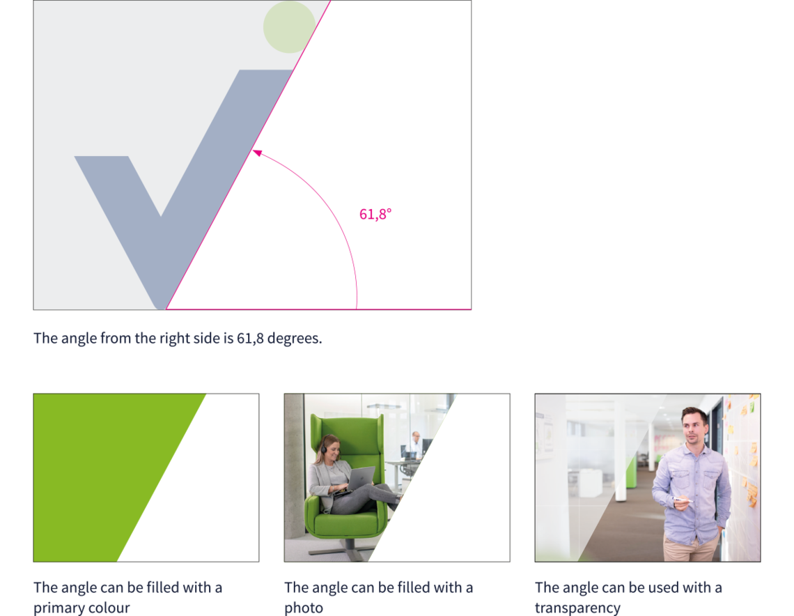
The V-angle is derived from the inclination of the Visable „v“.
The angle is 61.8 degrees.
This is how the angle can be used:
• filled with a primary colour
• filled with a photo
• used with transparency
Landscape and portrait format DinA4
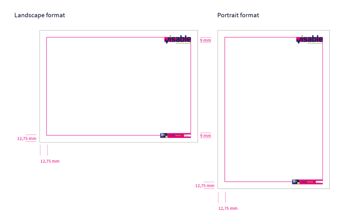
Clear positions and sizes have been defined for the logo and the
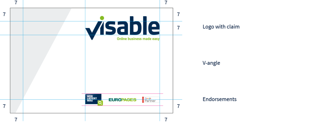
endorsements. On an A4 page in landscape and portrait format, the height of the logo x is 9 mm. The height of the endorsement is 9 mm.
The border around the page is 12,75 mm, which defines the printing
area.
The Visable logo is positioned with the letter „e“ in the top right
corner of the printing area.
The endorsements are positioned on the right side and centered on
the lower border of the printing area.
Landscape format DinA4/DinLong
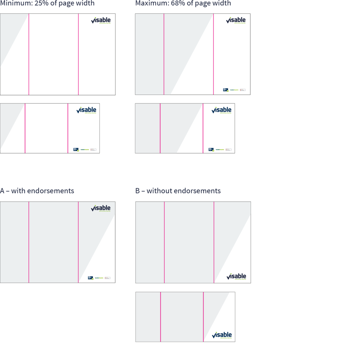
A minimum and maximum size of the V-angle have been defined for landscape format.
It is measured from the top or bottom of the page.
The V-angle must not start below 25% of the top of the page and must not exceed 68% of the page width, again measured from the top.
On the bottom of the page, the V-angle must not exceed 68%.
Between the minimum and the maximum size, the V-angle can be applied flexibly, in order to support the content.
With the V-angle on the bottom of the page, are two options:
A The logo is on top and the endorsements are on the bottom, placed on white in the V-angle. Here, the V-angle has a width of 68% of the page.
B The logo is on the bottom, without endorsements, placed on white in the V-angle. Here, the V-angle has a width of 68% of the page.
Note: The V-angle must not be cut through the Logo.
Portrait format DinA4/DinLong
A minimum and maximum size of the V-angle have also been defined for portrait format.
It is measured from the top or bottom of the page.
The V-angle must not start below 25% of the top of the page and must not exceed 58% of the page width, again measured from the top.
On the bottom of the page, the V-angle must not exceed 58%.
Between the minimum and the maximum size, the V-angle can be applied flexibly, in order to support the content. With the V-angle on the bottom of the page, there are two options:
A The logo is on top and the endorsements are on the bottom, placed on white in the V-angle. Here, the V-angle has a width of 58% of the page.
B The logo is on the bottom, without endorsements, placed on white in the V-angle. Here, the V-angle has a width of 58% or 25% of the page.
Note: The V-angle must not be cut through the Logo.

Examples for the landscape and portrait format DinA4
For best results and maxium impact, illustrations and images can be used with the V-angle.
They can be placed on top of the V-angle, which creates a fresh and dynamic page layout.
Images can also be inserted into the shape of the V-angle. Images must be carefully selected to work well with the shape.
For details selection criteria, please take a look at the chapter “corporate imagery”.
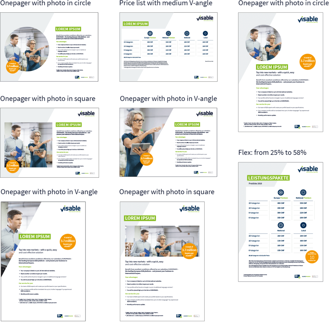
Here you can find the V-angle in all formats
We show authentic business reality and natural characters in small and medium-sized enterprises as well as our employees.
Motifs – customers, small and medium-sized B2B suppliers
The motifs shall be evaluated on the basis of our brand competence:
1. Trusted
2. Digital
3. Enabler
whereby the focus lies on the first and the third component.
For our customers, small and medium-sized B2B suppliers, this means:

TRUSTED – We show (dialogue) situations between business people (signifies: exchange between Visable employeesand [potential] B2B suppliers).

DIGITAL – We show digitized production and digital marketing contexts. We show our product on the screen.

ENABLER – We show pictures of success. The wealthy effect Visable has on suppliers where their performance and (Visable's) contacts meet, e. g.: A well-equipped research and development department, another bespoken product is completed in the production, the company‘s super-digitised storage works fine.
Motifs – employees
For Visable employees, this means:

TRUSTED – We show employees, especially in teamwork situations, in our company.

DIGITAL – We show aspects from online/digital contexts.

ENABLER – We show the effect one employee/team has on the successful company Visable.
Style and usage
The style is truthful, documentary and modern – it very much feels like an authentic, contemporary reportage.
Visable’s primary or secondary colours shall not be overrepresented. The colours are realistic, i. e. reduced, but adequately contrasted.
We do not use light effects, filters or exaggerated in-motion unsharpness. Anyways, images that do not fully comply with the style can be moderately optimised. The proportion between images and the rest of a medium’s surface as well as the images’ positioning are clarified in the chapter design principle. If only a section of an image is shown, it shall transport the context’s core message.
Do's

Authentic, contemporary reportage style

Realistic colours – reduced, but adequately contrasted
Don'ts

All Online Marketing Services icons are placed in a blue circle.
The Service Packages are shown in green circles and their add-ons in white circles with a green outline.
The illustrations are simple and clear.
Online Marketing Services

Service Packages


Here you can find our Online Marketing Icons
The icons can be colored in dark blue or negative in white.
Example icons

Here you can find our icons for print and digital use.
Graphs & infographics
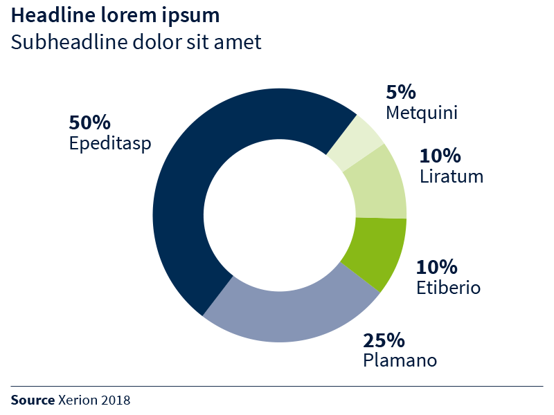
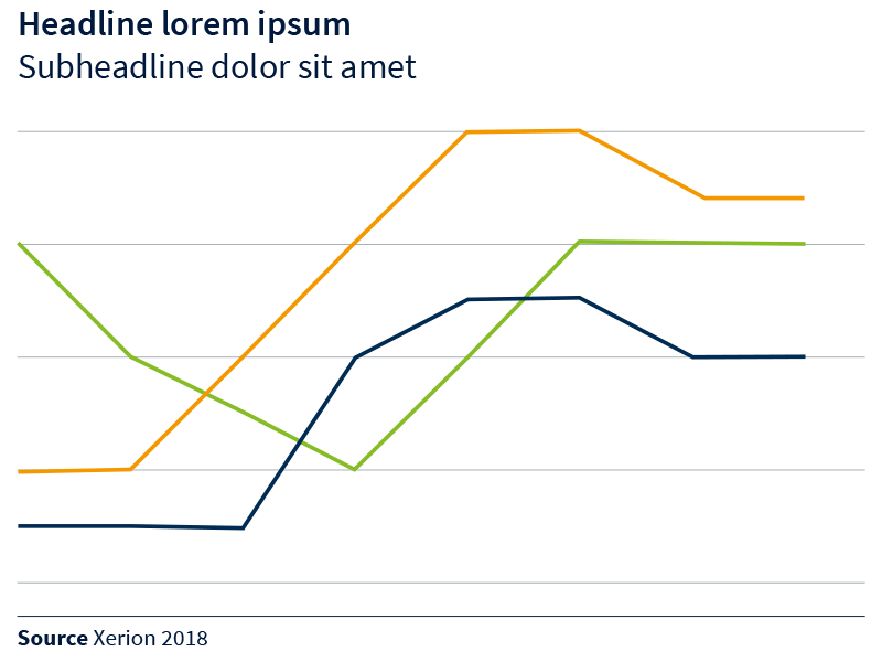
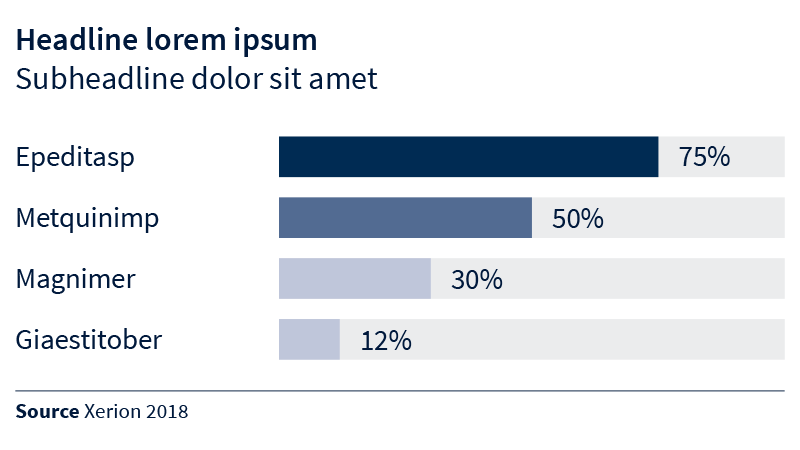
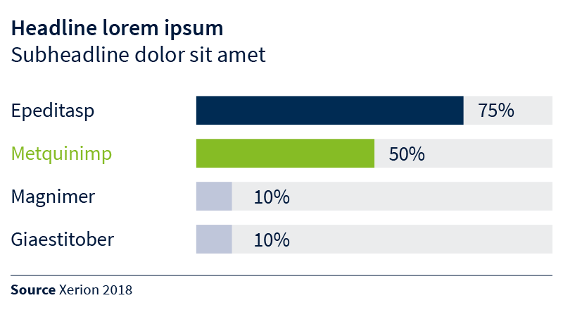
Diagrams help to present developments and statistics in a transparent, striking and comprehensible way. When implementing a chart, the chart style should be chosen in a way that reflects its content in the most simple and unambiguous way.
Primary and secondary colours can be used.
There are three display formats available for this purpose: pie charts, line charts and bar charts.
Attention must be paid to good contrast so that legibility and accessibility are guaranteed.
Colour scheme

Colour scheme pie charts

Colour scheme bar charts

Pie chart
Line chart
Bar charts horizontal
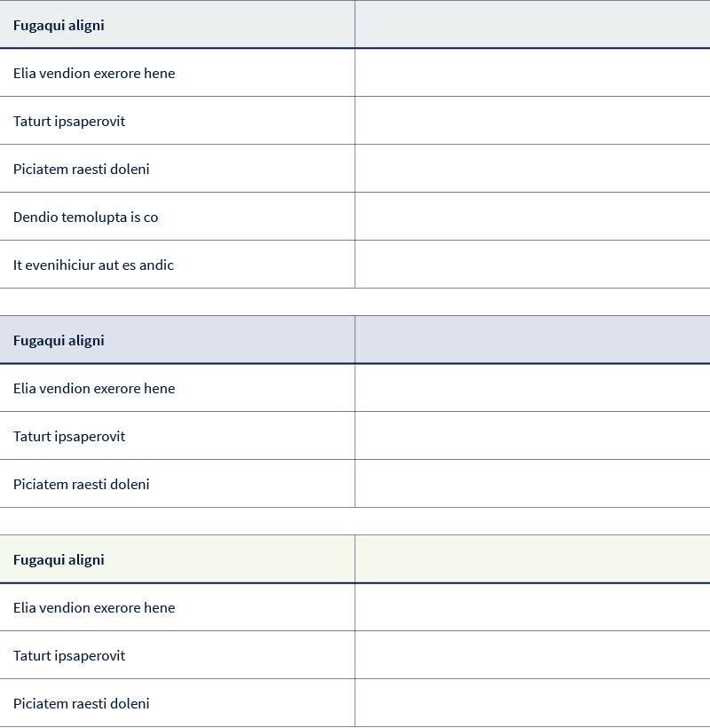
Tables
The endorsements describe how our corporate brand, our renowned product brands and third party product brands/partnerships quote or refer to each other in the form of a depiction of their logos, contents or links.
Endorsing does not mean “showing the product portfolio”.
In fact, it is like “word-of-mouth”. A brand indicates that it has a strong connection to another brand. Thereby, it leans onto the others’ reputation. If this information is relevant for the target groups, the connection supports the brand building process.
We do not refer to a product like “retargeting”, as it is not a brand.
We do also not refer to a brand like “Bing”, as for our target groups, it is not as relevant as e. g. the Google-partnership.
We do also not refer to a brand like "Yext", as it is not as familiar to our target groups and a white label-solution.
To date, the following brands are involved
in the endorsement process:
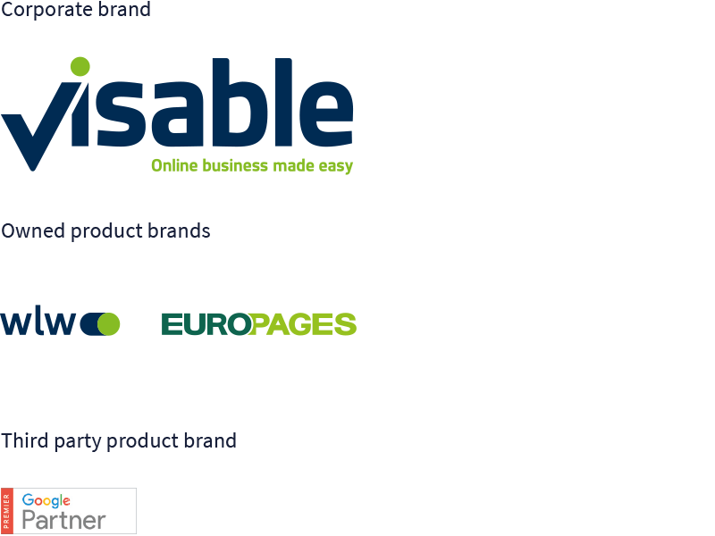
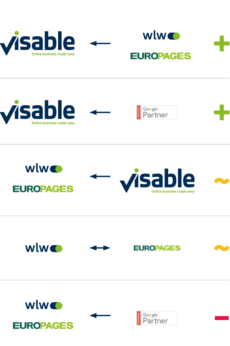
The brands involved in our endorsement process can relate to each other in the following scenarios:
A) The product brands appear in the corporate brand context. The renowned product brands support the new corporate brand! The awareness and trustworthiness of our product brands are used to introduce Visable and give it a headstart.
B) The third party product brands appear in the corporate brand context. They underline the expertise of Visable in online marketing and help us to position Visable not only as a corporate brand for B2B platform, but as a one-stop provider.
C) The corporate brand appears in the product context. Visable may only appear where B2B purchasers can be encouraged to become Visable customers (sales promotion) or in a context where B2B purchasers might have an interest in the organisation behind the platform.
D) The product brands refer to each other. Due to their local diff erentiation, wlw and EUROPAGES do not support each other a lot. Small indications in a context where B2B purchasers might be encouraged to use the other platform might be relevant, though.
E) The third party brands do not appear around the product brands. wlw and EUROPAGES do not benefi t from the third party brands at all – a reference to the fact that the suppliers, listed on the platform are possibly not factually relevant, but pushed though e. g. SEA might even be negative.
Focus of operationalisation
In the context of this guideline, we will give examples on scenarios A to C, whereby A and B always appear together (as wlw, EUROPAGES and Google are all renowned owned or associated product brands, strengthening Visable’s performance and brand building together). Scenario D is not part of Visable’s launch, and will thus not be concretised. E will not be depicted at all, as it has negative brand building effects.
A/B – The owned product brands and the third party product
brands always appear together in the corporate brand context.
- No competition between the corporate brand and the product brands – the corporate brand must be clearly identifiable as the addresser of a communication activity
- There is a fixed clear space area between the endorsement logos. It is depicted below.
The standard alignment of the endorsement logos is horizontal:

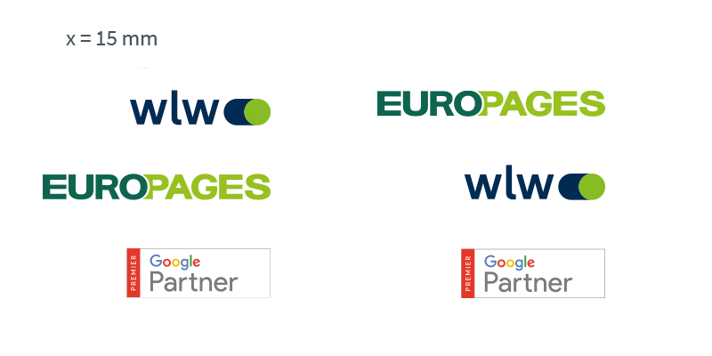
The alternative alignment of the endorsement logos is vertical:

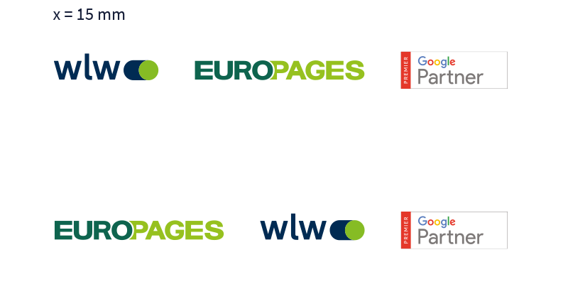
Logos in horizontal combination
The logos of the endorsement are always set in a clearly defined relation, in order to give every logo the desired space.
Note: On Visable materials, used specifically by our EUROPAGES colleages, the endorsement logo order may be alternated.
Relations and distances between the endorsements:
Logos in vertical combination
The logos of the endorsement are always set in a clearly defined relation, in order to give every logo the desired space.
Note: On Visable materials, used specifically by our EUROPAGES colleages, the endorsement logo order may be alternated.
Relations and distances between the endorsements:
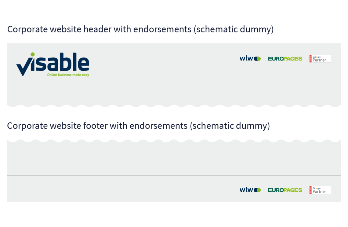
Endorsement (scenario A/B)
Examples
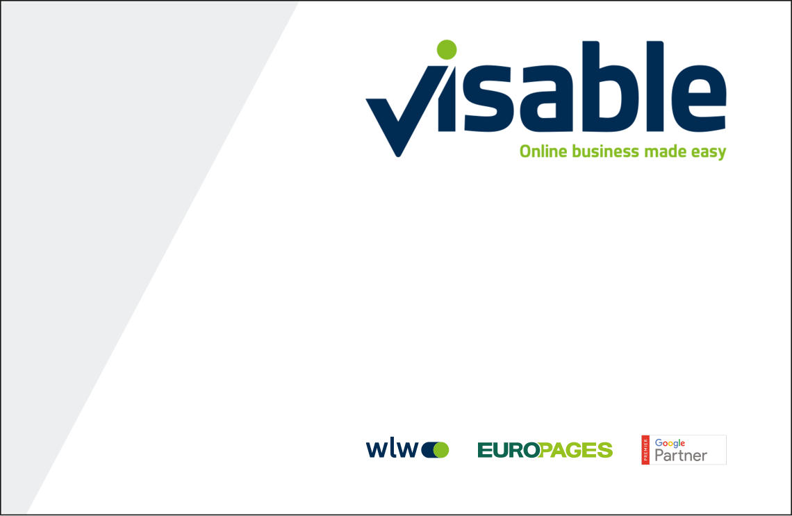
Business card back with endorsements
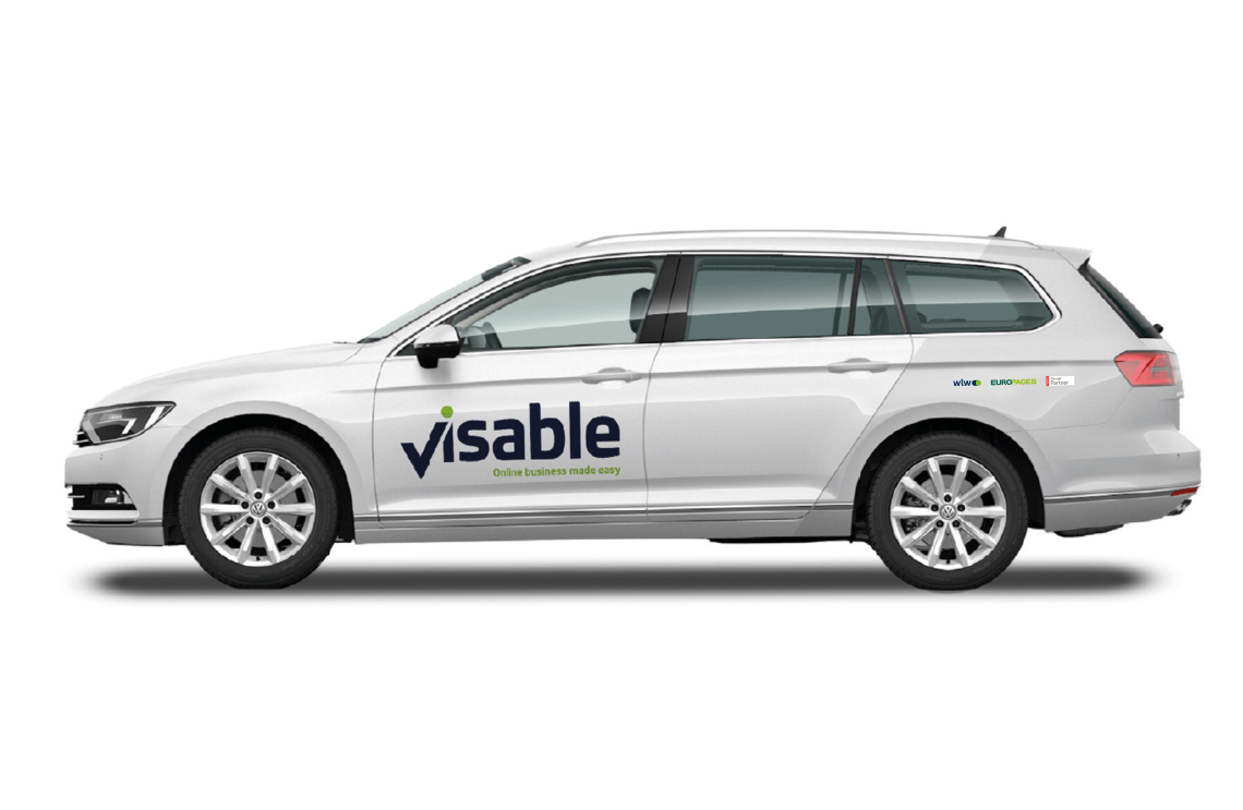
Fleet/cars with endorsements
Corporate website header and footer
Endorsement (scenario C)
Examples
No competition between the product brand and the corporate brand – the product brand must be clearly identifiable as the addresser of a communication activity.
The context of a touchpoint defines the form and extent of content, helpful to signify the endorsement.
A simple text form of the endorsement reads:
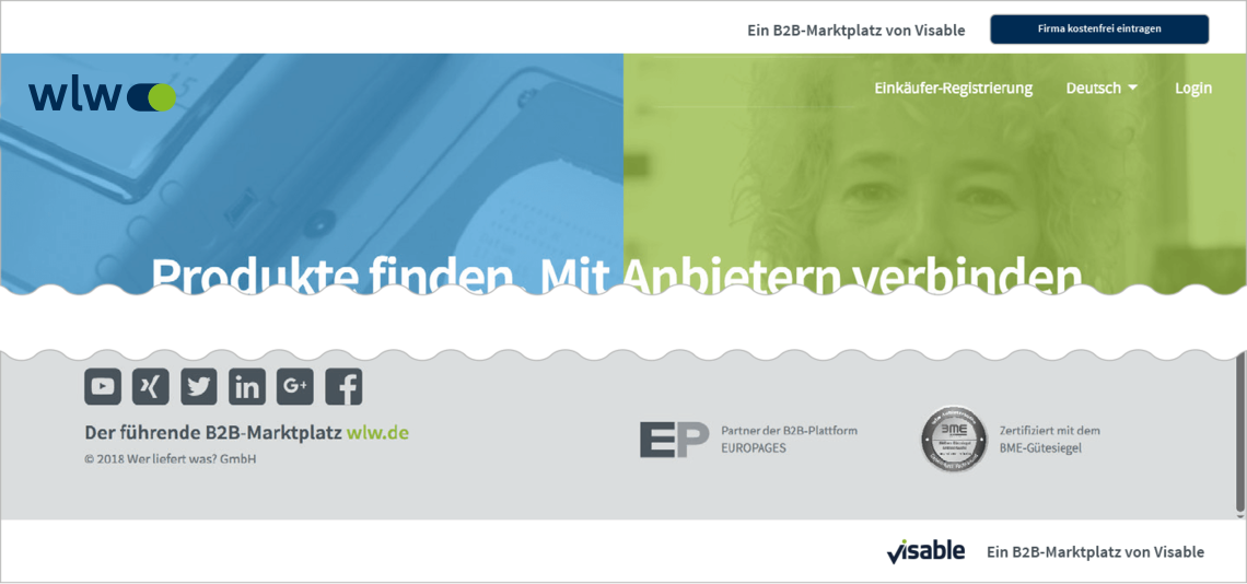
- Eine B2B-Plattform von Visable (DE)
- A B2B platform by Visable (EN)
The names of the platforms wlw/EUROPAGES may, but do not forceably need to be mentioned to complete the text form, e. g.:
- “wlw – eine B2B-Plattform von Visable“
- “EUROPAGES – a B2B platform by Visable”
The Visable logo may, but does not forceably need to appear around the text form of the endorsement. Example: ”Footer of the EUROPAGES platform”
Example: wlw platform
Example: EUROPAGES platform
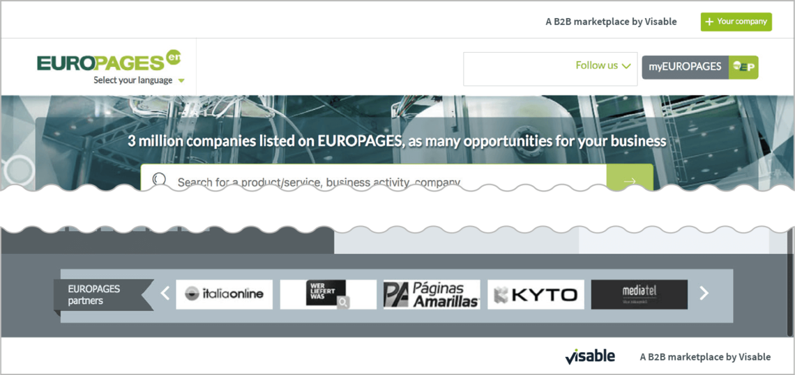
The text form shall be included in the footer, optionally additionally in the header of a touchpoint. If the touchpoint does not provide for suff icient room or the endorsement is of a limited relevance for the recipient, it can be skipped (example: a very long, narrow display banner).
Endorsments in portrait and landscape format
Brand Applications
Business cards
Format: 85 x 55 mm
Business card back with endorsement
Business card front regular version, address two lines

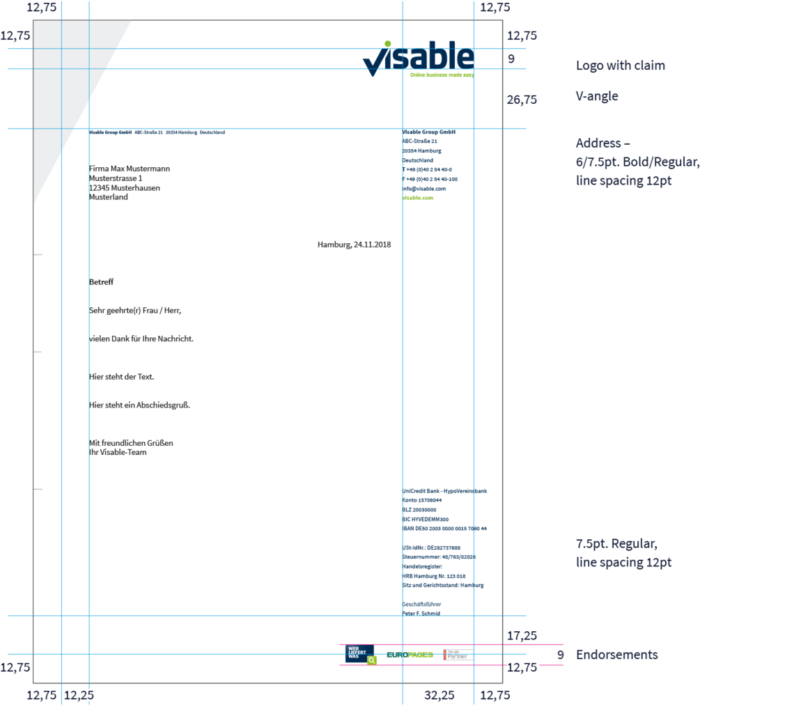
Letterhead
Format: DinA4
Letterhead front with endorsement
PowerPoint-Presentation
The Visable PowerPoint Master-Template

Downloads
Our house font Source Sans Pro can be found on Google Fonts (click here).
Remember: Only the bold, semibold, regular and italic font styles are used.
